October 14, 2025 | 199 Aufrufe
The Quest for the Perfect Controller Logo
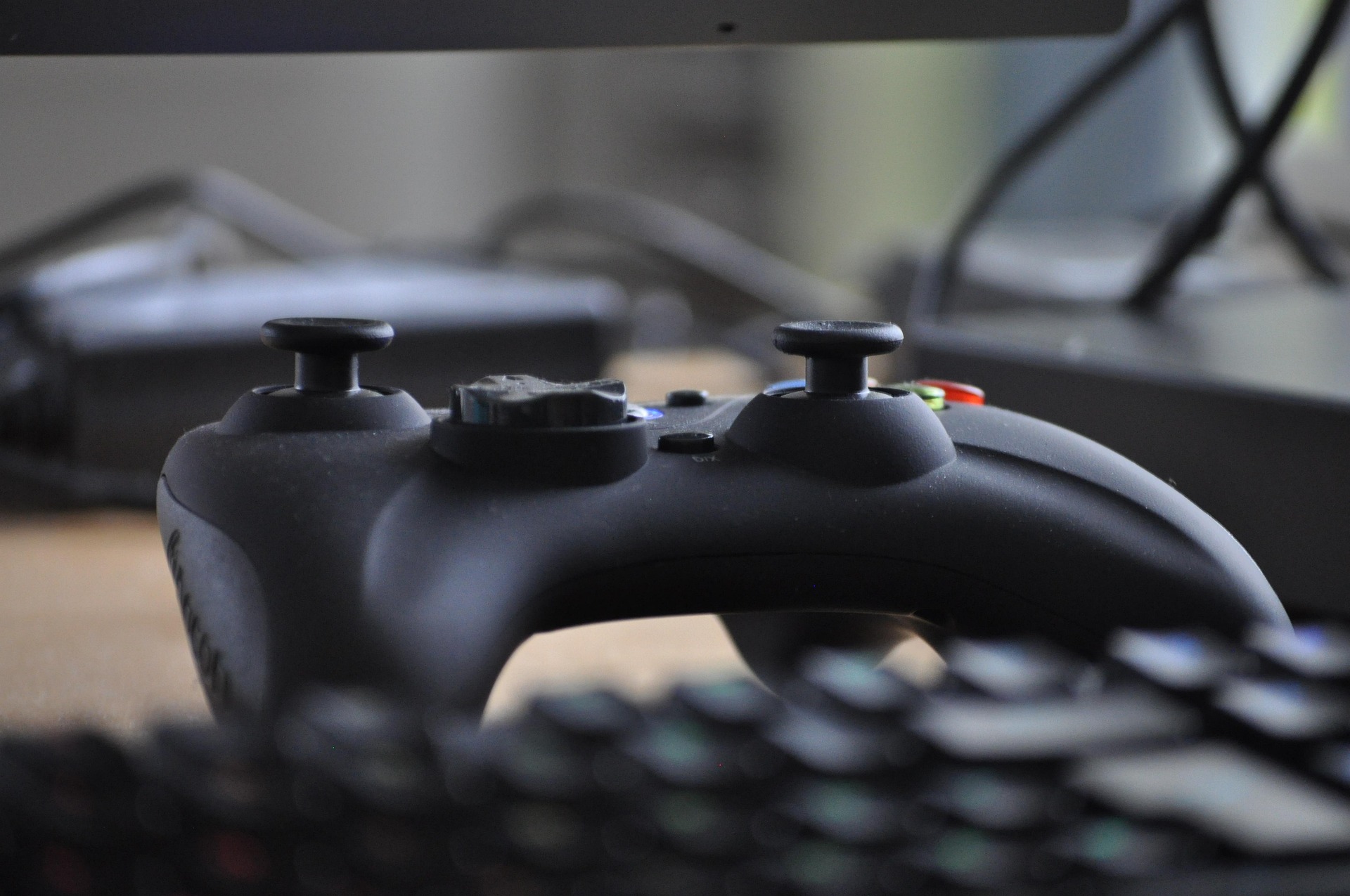
You’d think designing a simple controller icon would be easy, right? Yeah, we thought so too.
The idea sounded simple enough: a clean, friendly little controller that represents PlayerFinder. Not too edgy, not too cute — just right. But then reality hit us. Every “free” controller icon online looked either like it was drawn in MS Paint during a loading screen, or had the resolution of a 2003 forum avatar.
We tried everything — stock icons, SVG packs, even some AI-generated nonsense that somehow gave the controller six buttons on one side and a joystick on the other. It looked like a prop from a sci-fi movie where nobody’s actually seen a real controller.
Finally, three of us teamed up for what turned into a surprisingly intense design session. An hour later, after far too many “is this D-pad too chonky?” debates, we ended up with something we’re proud of — a clean, balanced controller that actually feels right. Smooth lines, perfect symmetry, and scalable from favicon to billboard without breaking a pixel.
It’s simple, but it’s ours. Every curve and button was shaped by actual gamers arguing about controller ergonomics like it was a matter of national importance. And honestly? That’s exactly how it should be.
Designed by gamers,
Approved by perfectionists — The PlayerFinder Team